
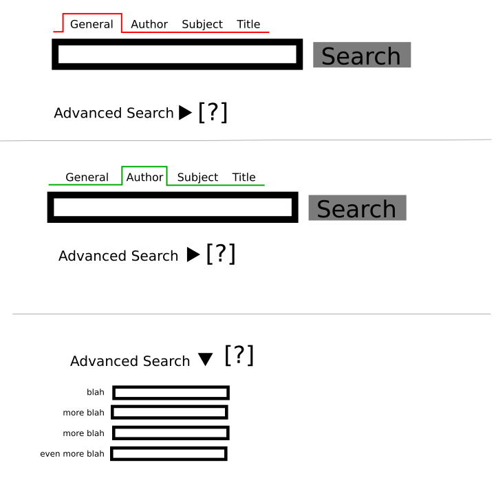
Hello all, Thought I would introduce myself before I start spouting off. I currently wear two major sets of "hats". The first is in the Ubuntu community. I am a longtime member of the Ubuntu Documentation Team, Marketing Team and have the unfortunately pleasure of leading the Ubuntu Canada team. My second hat is with Userful. Userful makes DiscoverStation, which is a Fedora-based (ick, I know) public computing distro. I am a sales person for them. Now that the introductions are out of way, I will dive into the meat of my message: The OPAC interface. All of the below comments are based off the zoomopac interface on http://zoomopac.liblime.com/ as of July 7th,2006 (in case somebody is digging through the archives for my words of wisdom^WWWinsanity) == Overall Goals == Any good UI makes easy things very easy and hard things less hard. It also emphasizes the common tasks over the uncommon. Blather aside, what does this mean? The following lack hard facts, but are gut feelings: * The most common thing somebody is going to be doing just searching. Enter term, hit enter * The next three most common things people search for are: Authors, Titles and Subjects, in no particular order. * Another common query I would say is "What boxes on X are in the branch I am in/going to, right now?" * Advanced searching beyond the above is going to be done by maybe 1:20, maybe even closer to 1:100 * Staff love advanced search interfaces. They do deal with it all day. They also want fast search interfaces == General UI comments == * Align text entry boxes, either right or left. Have the description tag beside them, not on top or the bottom == Search UI == * Search boxes have a common UI. It is a text entry field with the button with the word "Search" on it. Sadly, the new OPAC appears to have departed from this idea. * Drop down menus suck. They are hard to hit and hide information. Thus if we move Authors, Titles and Subjects, we need to have a something different. * Tabs are also bad, as they hide information. * AJAX is a must. This part is already done well * I thus suggest we have little "mini-tabs" above the main search bar. They are labelled: General (or some better term for all inclusive search), Authors, Titles, Subject. * Colours are good for reinforcing connected-ness, so the background of each of the mini tabs would be a different colour and as the user switched the minitabs, the box around the search entry field would change accordingly * The world is full of slow internet connections, thus we need to fool our users into waiting if the ILS is slow to respond. After they click search, the page should switch to a hidden div with the words "Searching" and an hourglass/busy symbol. Because this will have already been loaded, the ILS can take its sweet time in responding and the user will not get annoyed. * The [ ? ] takes me an IndexData help page, written by technical people for technical people. My eyes glazed over almost right away. You don't need help on the simple search page. It might be justified on the advanced page. == Non-search UI == This is the fluff around the search, login,etc. * There are two places to login to my account. The one on the right is fine * Viewing new additions should take to a page with a complete listing, newest at the top. After I am there I can search for specific branch/subject/author/etc. Attached is a png showing a rough mockup. I don't claim the mockup is even roughly complete, but it does show the general idea. Cheers, Corey
participants (1)
-
 Corey Burger